Artistic Inspiration:
For my flag design, I was inspired by Chermayeff & Geismar & Haviv. They are a brand design firm that has made many trademarks for different businesses. They specialize in brand identities, print, motion graphics, exhibitions, and architecture. They made logos for brands such as Chase bank, NBC, and Mobil, National Geographic, etc. My flag design was inspired by their art because they used specific forms and ideas to create logos for these brands. These logos/brands look one way to the viewer, but also there is a deeper meaning and connection in-depth of the logo itself. It symbolizes something about the brand itself. There are some different things that symbolize Milwaukee and that connect to the deep history of the city. Especially things that Milwaukee is famous for. These symbols help represent Milwaukee the best and help create a connection in the city. This also includes the overall culture of the city, through the different immigration periods of the German and Polish. These two ethnicities have built Milwaukee to what it is now. |
Title: Milwaukee Pride
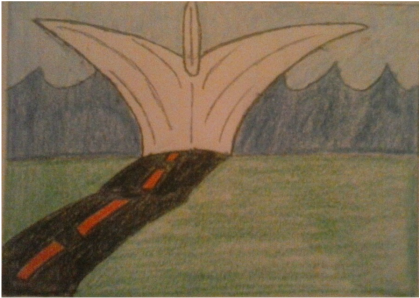
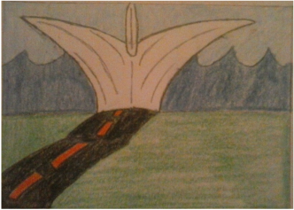
Size: 12.7cm. x 17.8cm. Medium: Flag November 2015 Exhibition Text: My design revolves around symbolic representations of Milwaukee. I wanted to capture a few of the many things that symbolize Milwaukee as a whole. Especially the famous things, and some historical representations that have built Milwaukee to what it is today. Citations:
Wide Eye Creative. Chermayeff & Geismar & Haviv. 2003. Web. 10 November 2015. http://www.cgstudionyc.com/ Harley Davidson. Harley Davidson Timeline. 2015. Web. 11 November 2015. http://www.harleydavidson.com/content/hd/en_US/home/museum/explore/hd-history/1900.html Milwaukee Art Museum. Milwaukee Art Museum Quadracci Pavilion. 2015. Web. 13 November 2015. http://mam.org/info/details/quadracci.php "Milwaukee beer barons." Milwaukee Sentinel (31 July 1892). Online facsimile at: http://www.wisconsinhistory.org/turningpoints/search.asp?id=1192; Visited on: 11/18/2015 |
|
Process:
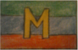
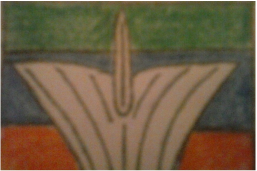
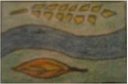
For all of my designs I wanted to create a flag that would best represent the city of Milwaukee, and the best way to represent the city with symbols and colors. I had four designs that I made to implement into my overall design. I wanted to incorporate many things about Milwaukee, but I didn't want to make it too complicated, like the what the city flag looks like today. The main things that I included in each flag was: Harley Davidson, Lake Michigan, the Art Museum Calatrava, and the wildlife. I used colors to symbolize and pictures to symbolize these aspects about Milwaukee. Harley Davidson is represented in black and orange. Lake Michigan is represented in blue. The Calatrava is represented by the basic structure of it, and the color white. Lastly, the wildlife is represented by green. For wildlife, I meant more of the plants and trees that are in Milwaukee. For my first sketch/design of my flag, I had an "M" in the middle to stand for Milwaukee. I made it yellow/gold for the brewing industry here in Milwaukee. I made horizontal stripes to incorporate the previous mentioned symbols in the flag. Green for wildlife, blue for the Lake, and orange for Harley Davidson. I thought that this was a good way to represent these aspects of Milwaukee overall. It was a simple way of representing Milwaukee and what symbolizes the city. For my second sketch, it was like the first sketch but this time with the basic structure of the Calatrava in the middle. I incorporated the Calatrava not because it is a well-known structure, but because of the architectural concept of it. Once again I had stripes to represent the previous aspects of Milwaukee. Being green for wildlife, blue for Lake Michigan, and orange for Harley Davidson. It allowed to represent Milwaukee while adding the basic structure of the Calatrava to make it more appealing to the eye of the viewer. For my third design I made a wavy stripe going through the middle to represent the waves of Lake Michigan. At the top of the piece I made a piece of wheat to represent the brewing industry which is in the color of yellow/gold. At the bottom I made a leave to represent the wildlife, but I made it orange to specifically highlight the leaf color in the season of autumn/fall. This made the flag a little confusing because of the layout of the flag. I think that it is a better way to represent a specific season in Milwaukee, which was fall. For my fourth and final design it is the design that I made the decision for it to be my final flag design. It captures many of the previously mentioned aspects of Milwaukee. I have the Calatrava in the middle of the piece but it is placed to look more off into the distance. I made the basic structure of it to represent the architectural concept of it, but all of Milwaukee's building architecture in general. Behind it are waves that are blue to represent not only Lake Michigan but also the Lakefront. The road leading up to the Calatrava represents Harley Davidson. The road is black with the dashed lines orange to represent it. Also, one of Harley Davidson's phrases is "to ride the open road". I thought that it would be best to represent it with a road to connect with Harley Davidson's phrase. Reflection: This project was a really cool project. Especially the fact that it was also a learning curve for me. It helped me understand more of the hidden things about the city I live in being Milwaukee. I think that some of my representations and symbols could have been more symbolic in meaning and I could have added symbols inside of some symbols. This would allow to make connections between things to show how the city is built, and why it is an important city. It was hard not to add a lot to the flag designs because there are many things that represent Milwaukee, and what the city is based off of. Except, it is hard not to make it too complicated because a flag is suppose to be a simple, symbolic representation of the city itself. |
