|
Title: Tyler Balke Self-Portrait
|
|
Exhibition Text:
For my self-portrait, I wanted to do an Impressionist piece. Particularly a Post-Impressionist portrait. My portrait was inspired by Vincent Van Gogh, and I liked how his paintings were constructed, and his style of painting. I wanted to incorporate his use of brush strokes and test how it expresses emotion in my portrait. |
Meaning of Piece:
For my portrait, I was inspired by the work of the famous Post-Impressionist Vincent Van Gogh. I've always liked his art work, and for this self-portrait I decided to try Van Gogh's painting techniques and put them to the test. I wanted to make a self-portrait that displayed a unique style of painting. I decided to do it like this also, because I wanted to show my artistic ability outside of what I'm normally known for by my friends. This being a person who loves baseball, and a intelligent young man. |
Artistic Inspiration:
For my portrait, I was inspired by the work of the famous Post-Impressionist Vincent Van Gogh. I have always been inspired by his artwork and his style of painting. His style was very interesting, and it was very detailed. Van Gogh used a painting technique known as "Impasto", which is the use of thickly textured, undiluted, and the paint appears three-dimensional on the canvas. His brush strokes are usually visible, and he mixed colors on the canvas to attain the color that he needed. Van Gogh didn't only use impasto to add dimension, but to also add emotion and movement.
For my portrait, I was inspired by the work of the famous Post-Impressionist Vincent Van Gogh. I have always been inspired by his artwork and his style of painting. His style was very interesting, and it was very detailed. Van Gogh used a painting technique known as "Impasto", which is the use of thickly textured, undiluted, and the paint appears three-dimensional on the canvas. His brush strokes are usually visible, and he mixed colors on the canvas to attain the color that he needed. Van Gogh didn't only use impasto to add dimension, but to also add emotion and movement.
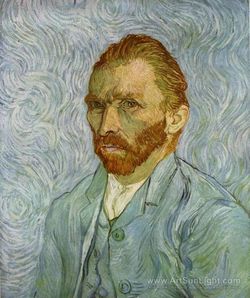
Self-Portrait. Saint Remy. Van Gogh, Vincent. 1889. Web. 13 December 2015. http://www.artsunlight.com/artist-NV/N-V0002-Vincent-Van-Gogh/N-V0002-0804-self-portrait-saint-remy-september.html
Process:
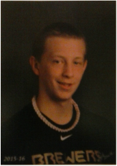
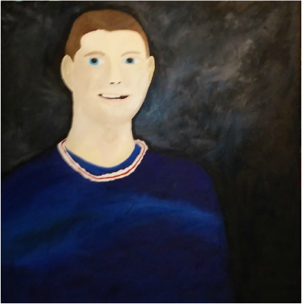
For my self-portrait, I based it off of a photo of myself that I already have. This photo is my picture day photo for the yearbook for 2015-2016. I wanted to use this picture because it had a good balance of contrast. This photo had areas where it was light, and parts where there was significant shadowing occurring. I also chose this picture because it had a good balance of color and an interesting background color combination, that would help display the different skin tone shades that are occurring. I felt that it was important to incorporate that to give the portrait a good quality of contrast to help balance the different color tones not just for the skin tones, but for the shirt, necklace, and even the background color.
For my first sketch, I did a standard frontward facing position. This way there wouldn't be a shoulder turned. It also looks interesting and it's a different setup than most self portraits. A lot of self-portraits that I have seen, usually have a shoulder turned which also helps depict where the shadow is coming from on the skin tone. It though would be more difficult in showing a three-dimensional shape for the body, and for a lot of the facial features. The facial features throughout my experience of primarily drawing them specifically need enough shading that contrasts it from the body itself to make it 3-D. Except, it also needs to blend in with the skin tone to also give it the look of a three-dimensional quality. Nothing is just outlined by lines, we're not two dimensional. We're three-dimensional, which needs that look in order to truly understand the piece. This format would have presented mini challenges within itself. Especially with the shadowing as there is not just one side that receives a lot of the light source in the photo.
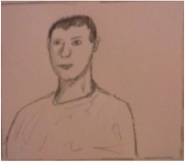
In this sketch, the left shoulder is turned more toward the viewer. Or toward the camera. This way it would also present a different angle that most portraits, and it would actually follow a lot of the formats that Van Gogh had his self-portraits in. This sketch though didn't really work for me and I didn't really use it because it didn't correspond with the photo that I chose. The photo that I chose has an effect on which sketch would benefit me, and that would correspond with the picture. This sketch is limiting because unlike the shadowing of the right cheek wouldn't fit how the actual picture that I used displays. There is a direct correlation to which sketch would be most beneficial, toward making the self-portrait.
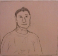
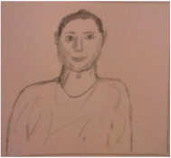
This sketch definitely worked with the picture I selected. It corresponds completely and it allowed me to get an accurate understanding of the shadowing in the photo. Which is important because it allowed me to create a good skin tone for specific parts of the face and neck. This then also helped me understand how to blend these colors to make it look close to what the picture looks like. It would also let me focus on detail, and accurately paint the detail while I painted through the portrait. This sketch also allowed me to get an understanding not just of the shadowing but the three-dimensional shape of the portrait, and how the shadowing effects and manipulates the way the three-dimensional formulates the portrait.
When I was painting my self-portrait, the main thing that I specifically focused on was the shadowing and detail. I added my own style to the signature short brush stroke technique that Vincent Van Gogh used in his art. The easier parts of the painting was the background, even though it has a couple different gradient color tones of black and white used and combined to create this cool looking background. The other easy part of the portrait was painting the shirt. The shirt though too, also had detail in the way of how the lighting affected the shade of blue that the shirt originally displayed compared to how the lighting manipulated the blue on the shirt. It made almost a wave of different, closer shades of the same blue but it definitely displays how lighting affects objects.
Reflection:
In my self-portrait, I think that I definitely did a good job of accurately creating the right skin tones. Especially how the shadowing affected the skin tone, and the lightness and darkness. I focused on the detail that the actual picture displayed, and tried to replicate it, but with my style of painting. One thing that I would fix is how I created the brush strokes and the shortness of them. Especially how crisp Van Gogh's strokes were. I think though an artist's own style should be implied in the replication of trying to use another artist's techniques. It allows for a twist rather than trying to be original which is almost impossible to have the ability to do now.
